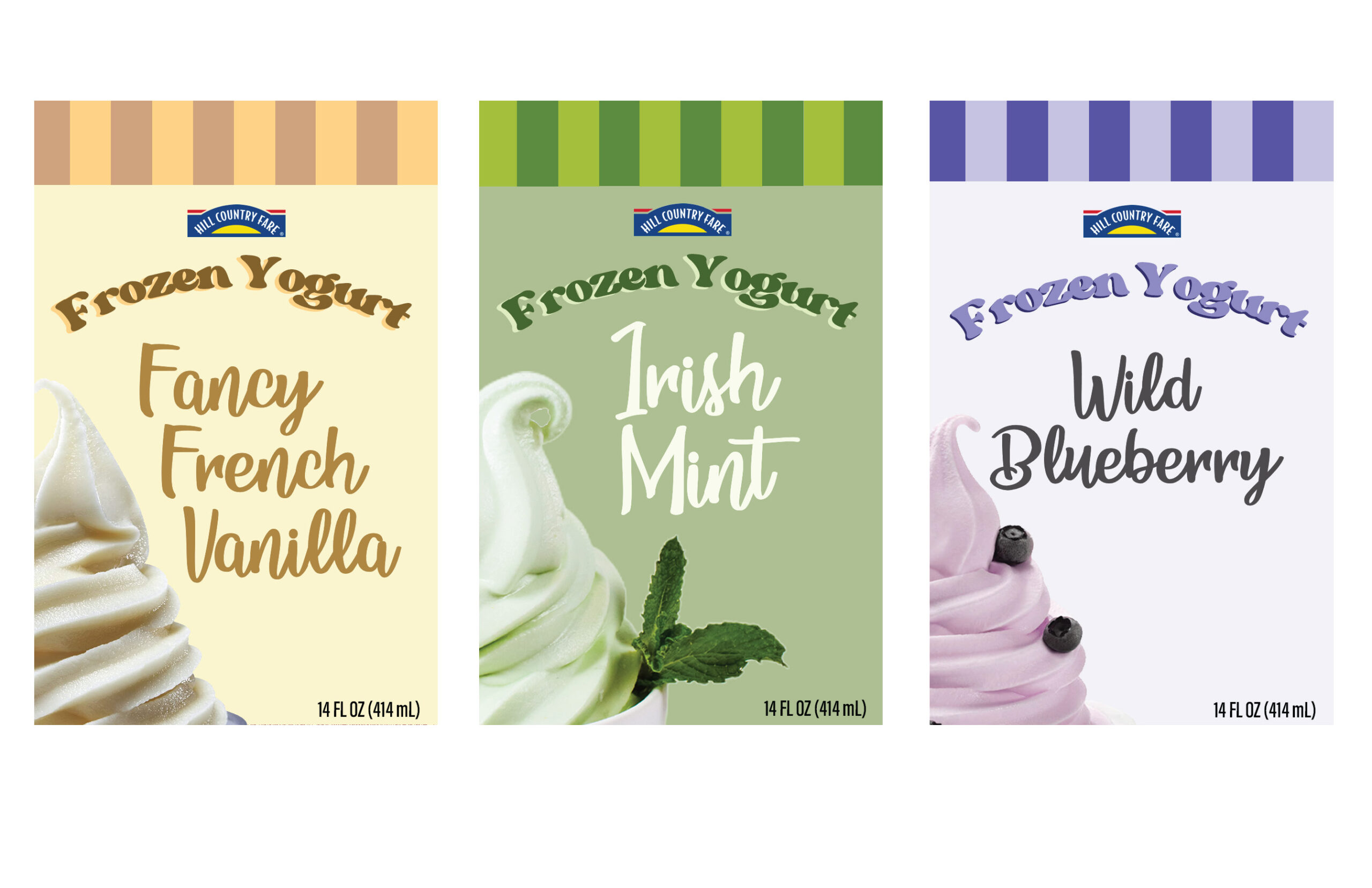
This project is about understanding the difference of packaging between a name brand and a generic brand. I reached my final decisions by going through the issues of how to make a packaging stand out and work for the brand. With this project, a design challenge I had to overcome was finding something that isn’t already made in a similar style and making it read as frozen yogurt rather than ice cream. One of my methods was making sure to emphasize the product and flavor.
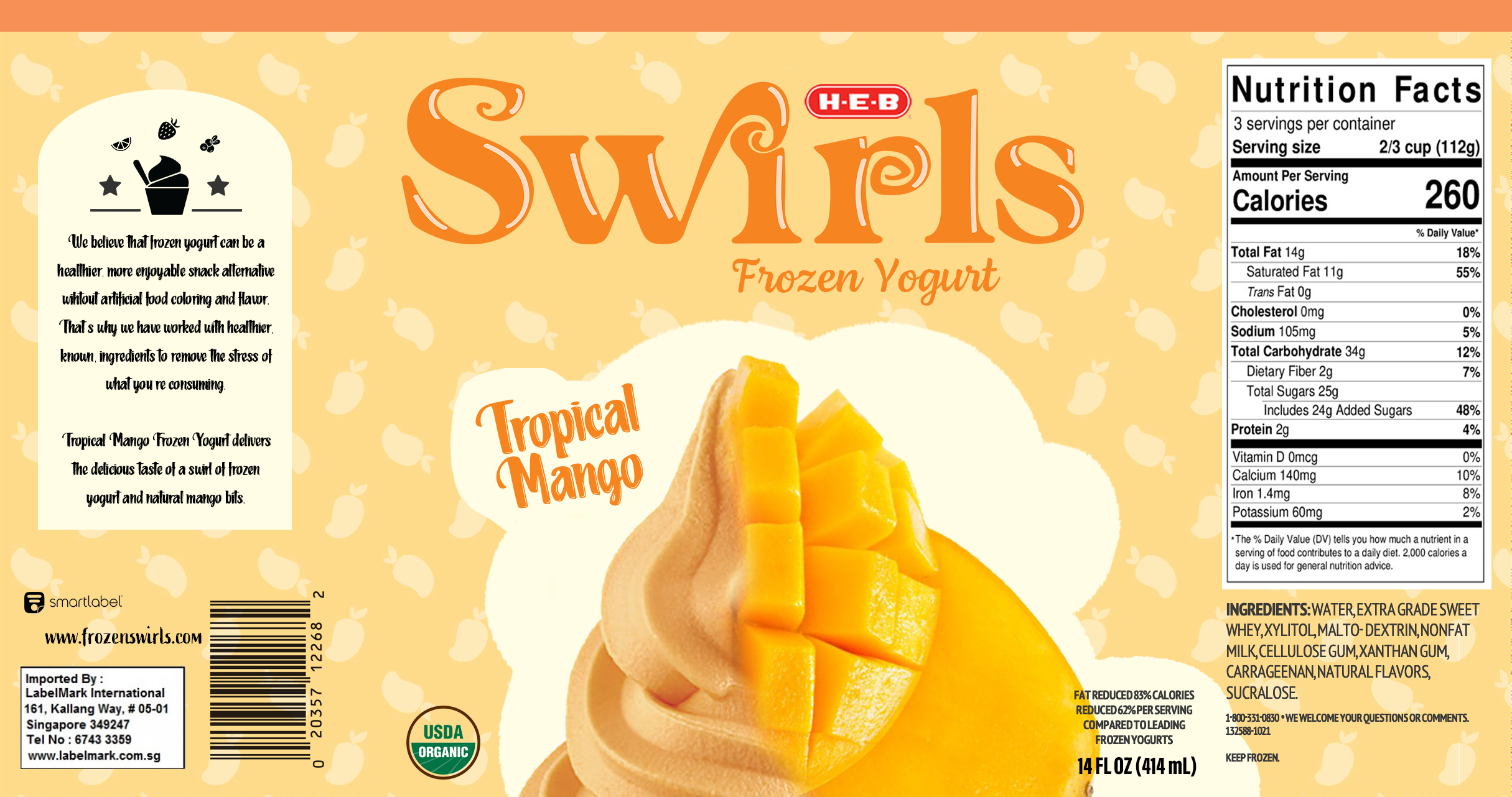
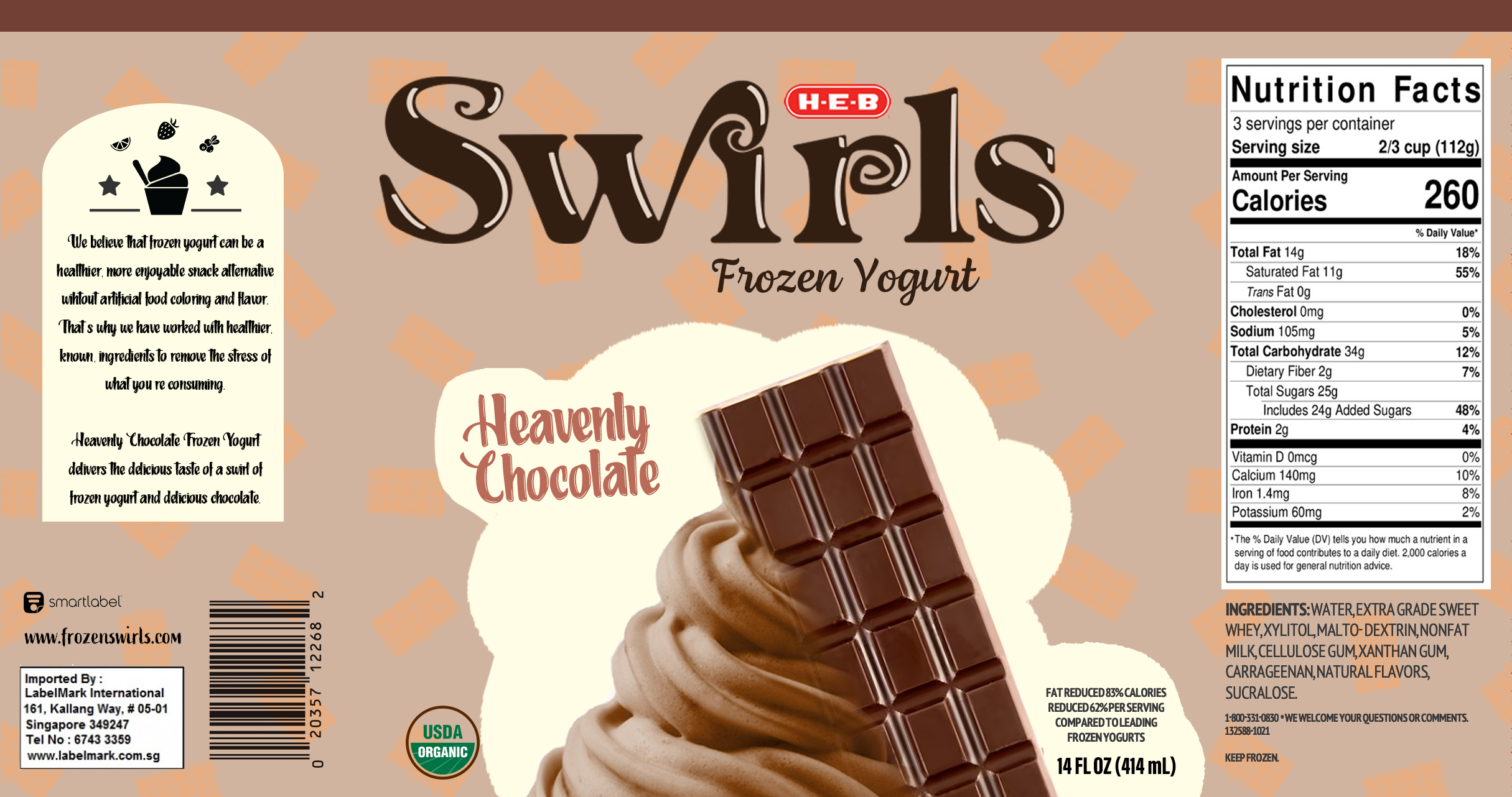
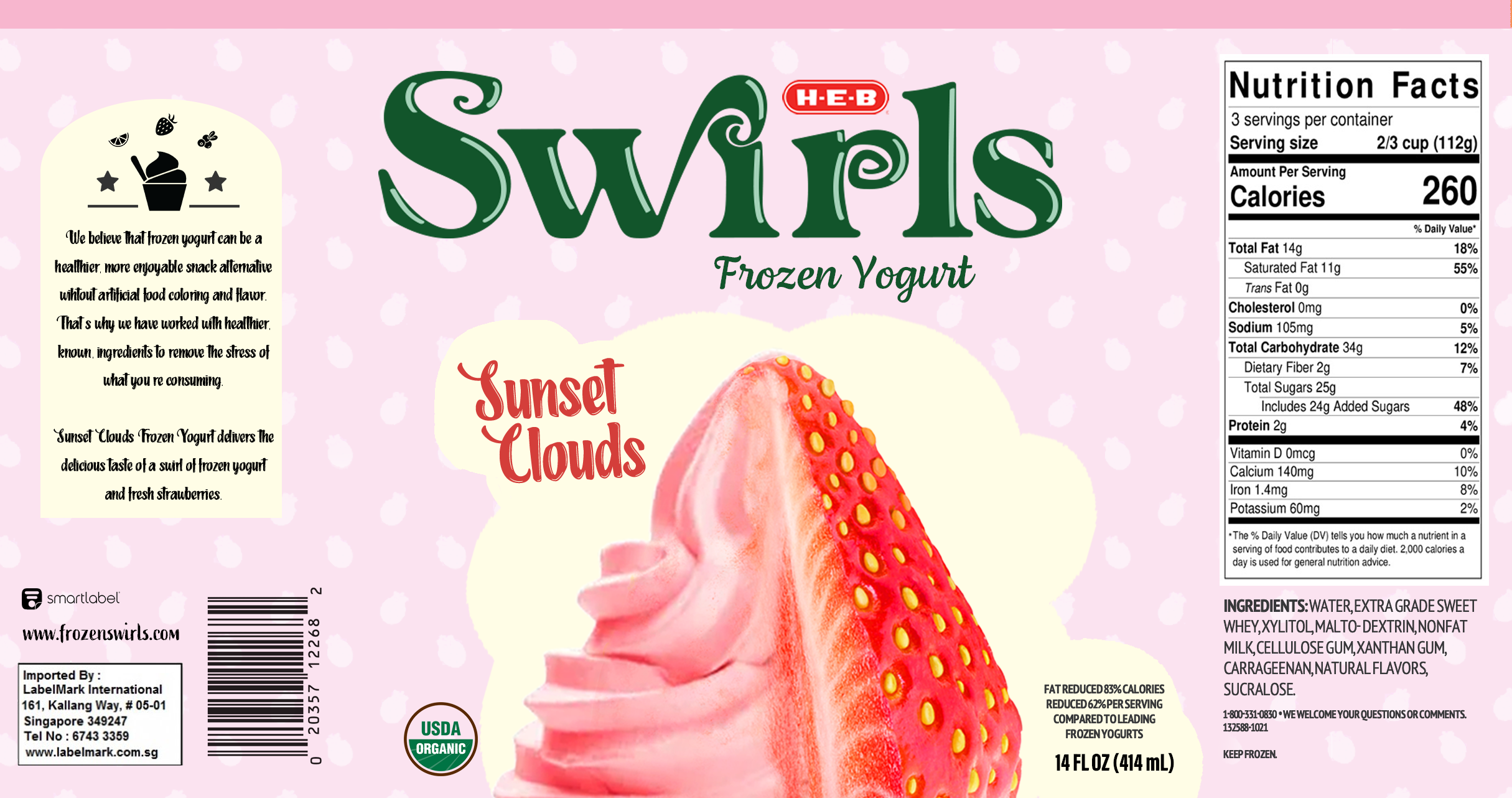
Container labels
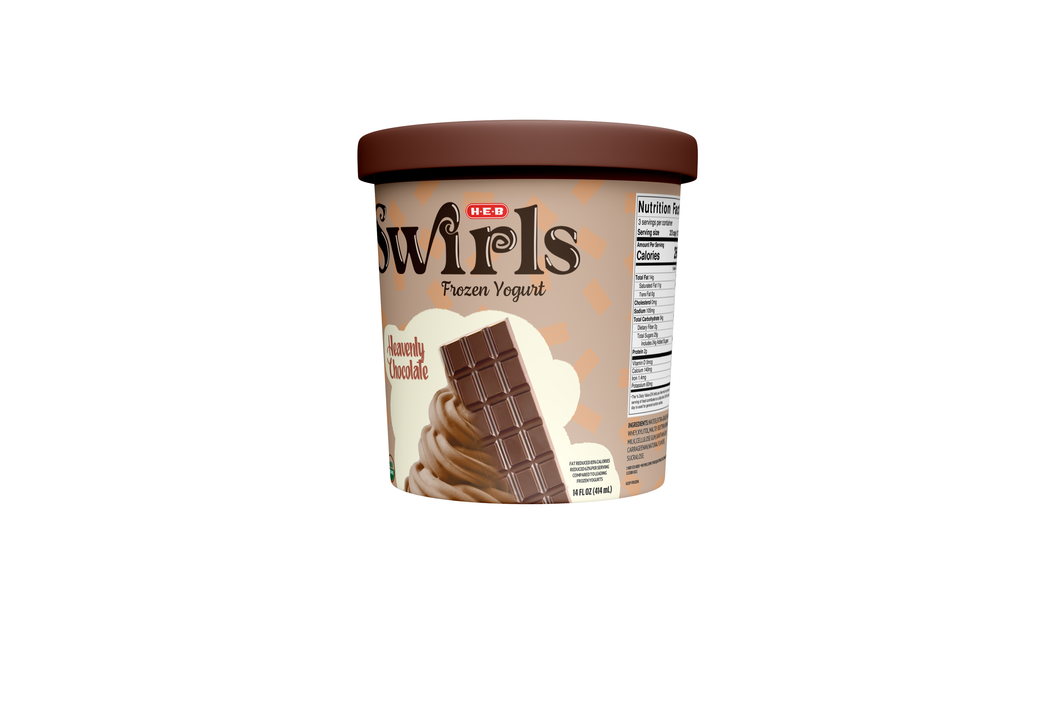
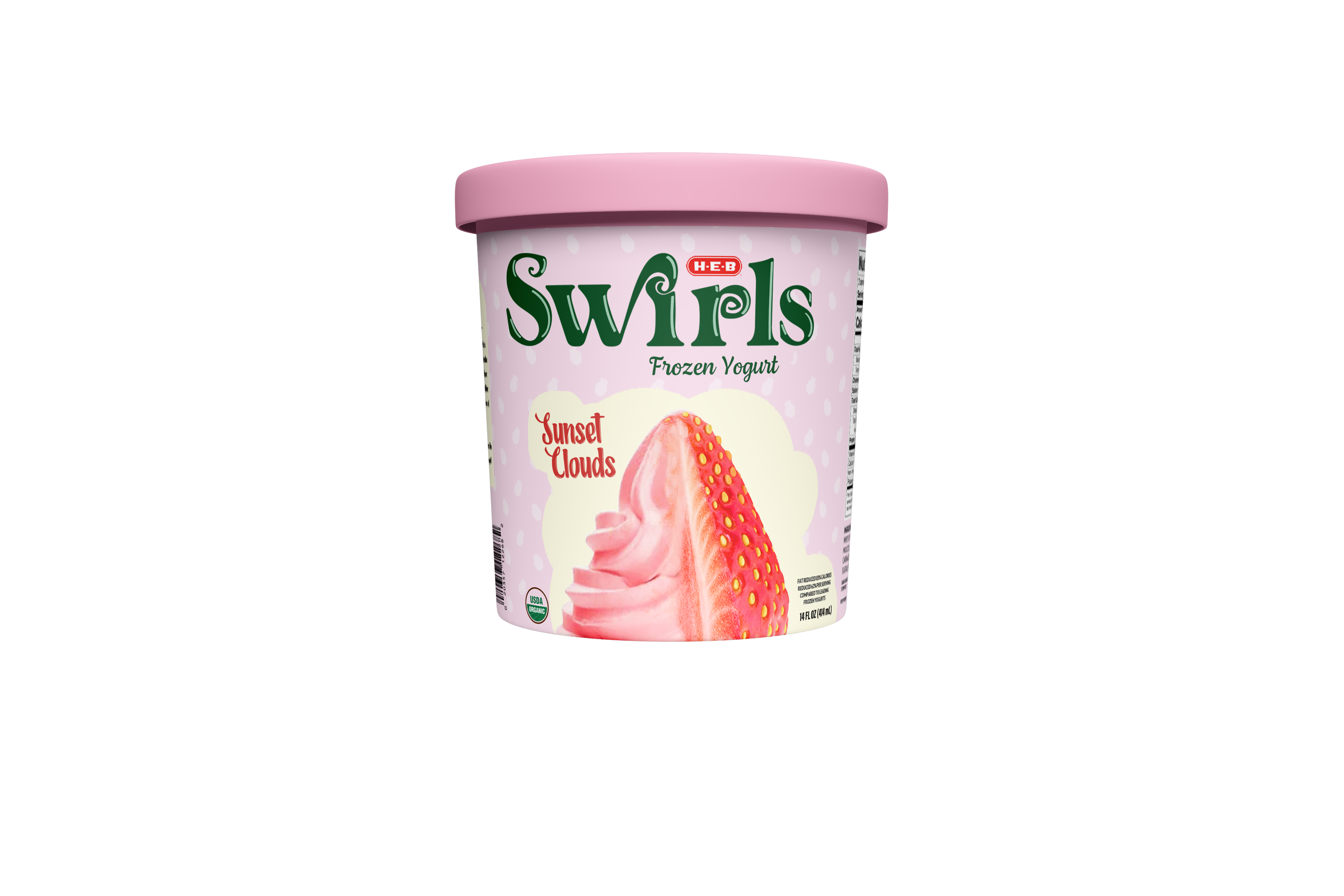
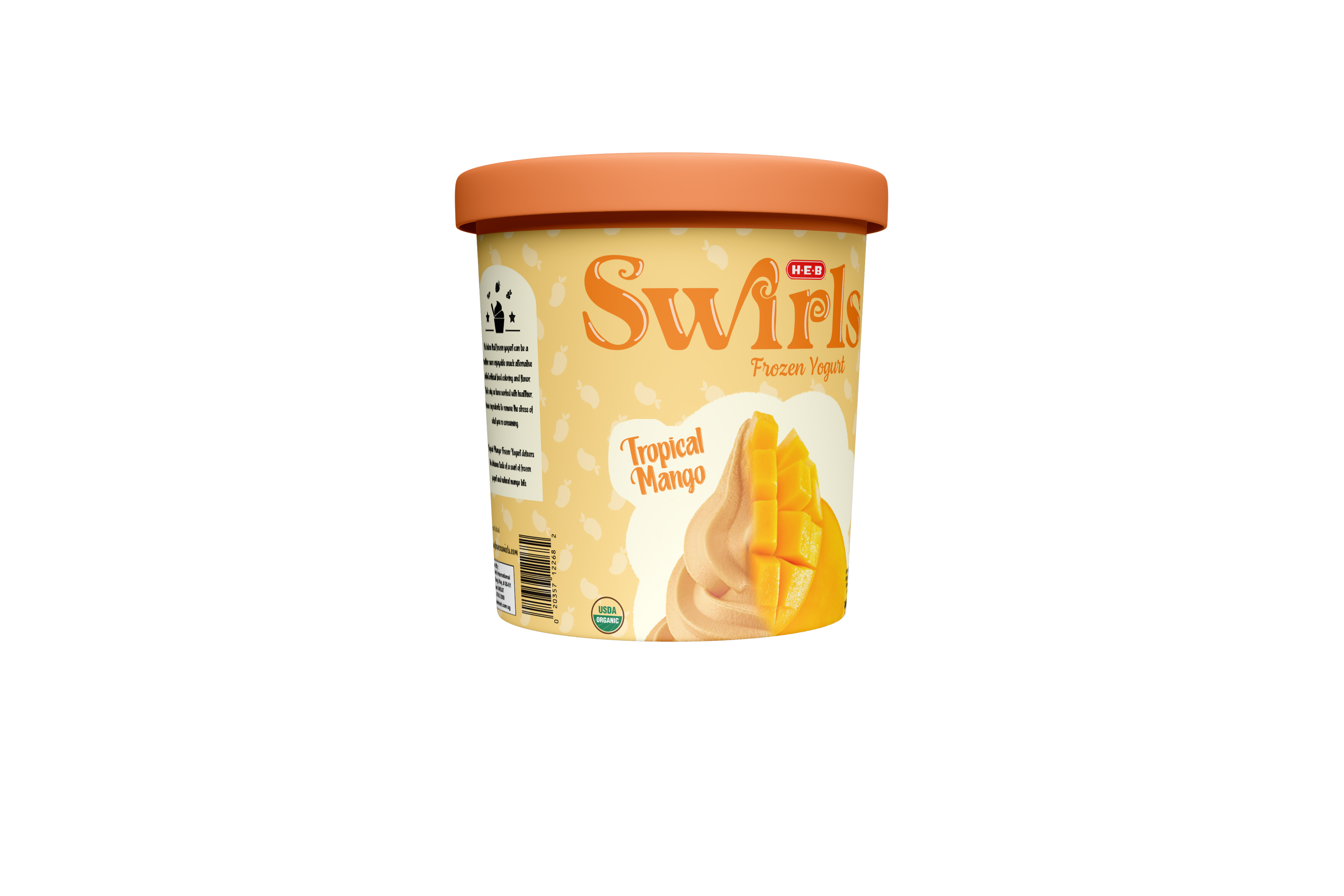
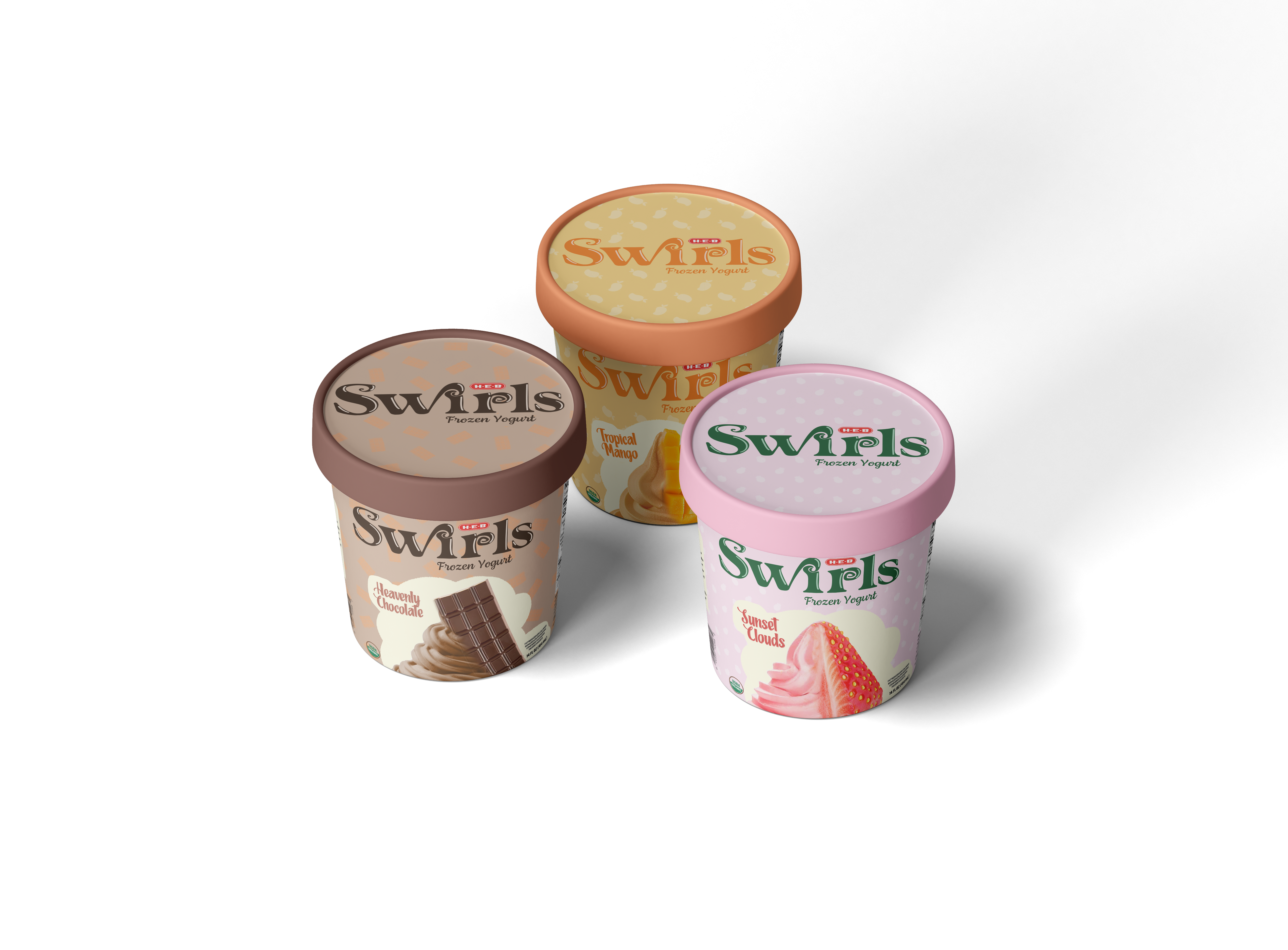
Container Design
Follow me on instagram! @mc.graphics_